Here are a few things to remember when selecting a particular layout in Page Builder.
Below are the 12 layouts where we can change the slot content from the story to ad or widget.
1. Arrow: Eleven Stories
The layout features 11 stories, with two stories prominently highlighted in the center. This design is well-suited for a collection of stories page.
However, it's essential to be aware of a known behavior associated with this layout. If a widget or Ad is added to the layout, it may result in an empty space or widget space appearing in the third row at the bottom. Regrettably, this issue cannot be addressed due to the layout's limitation in supporting subsequent load count functionality.
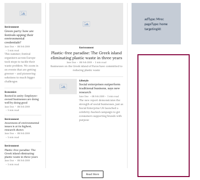
2. Arrow: Three Col Seven Story
The layout features a collection of 7 stories arranged in 3 rows, with one story taking up the most prominent space. The design is specifically tailored for the "collection of stories" page type. There is an Ad/Widget slot. The ‘read more’ button does not have a subsequent load count.
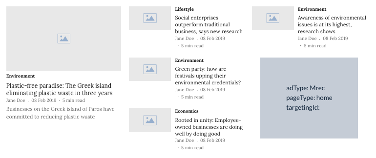
3. Arrow: Two Col Six Stories
This layout features six distinct stories arranged in two columns. To enhance readability and visual appeal, one story is prominently displayed and occupies the largest space. This layout is specifically designed to support a variety of story page types effectively. Additionally, there is a designated Ad/Widget slot thoughtfully integrated into the design, allowing for seamless ad placement.
The ‘read more’ button does not have a subsequent load count. Furthermore, when you choose this layout, you'll notice a space below the story that occupies the most space. This space is intentionally reserved for displaying a subtitle directly related to the selected story.
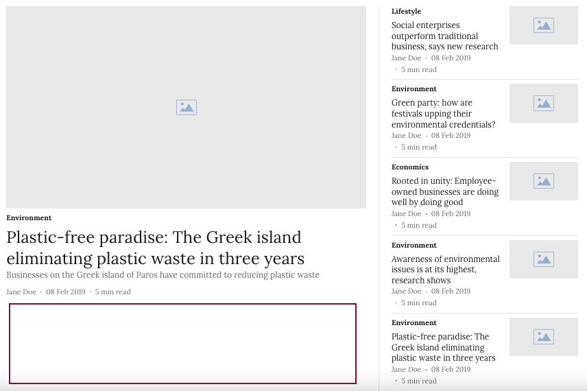
4. Arrow: Four Col Five Stories
The page features a layout designed to showcase stories in a visually appealing manner. The stories are presented in two rows, with one story occupying a prominent position and taking up the most space on the page. This layout is specifically optimized to support the collection of stories page types.
In addition to the stories, there is an Ad/Widget slot strategically placed within the page. This slot allows for the integration of advertisements or widgets to enhance the user experience and provide relevant content.
Furthermore, each story is accompanied by a 'read more' button, which allows users to access additional content or details beyond the initial preview.
In this layout, you see an empty space/widget space after the 5th story when you add a widget or Ad to the layout. You just need to increase the subsequent load count to fix this wide space issue. Also, enabling users to load more content as they interact with the 'read more' button, ensuring a seamless and immersive reading experience.
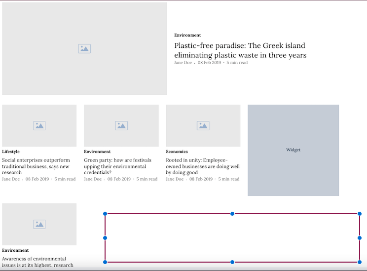
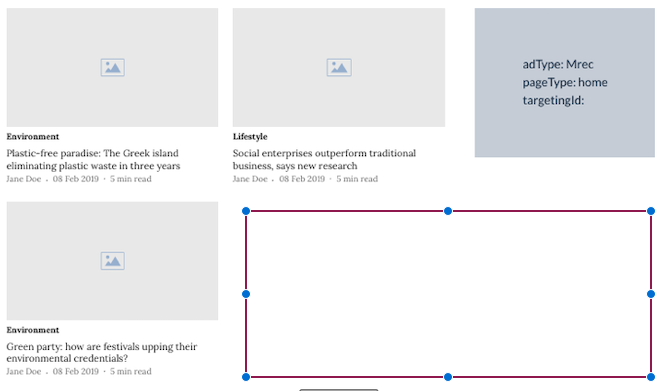
5. Arrow: Three Col
The updated layout features three stories displayed in a row with an Ad/Widget Slot. This design supports the collection of stories page type. One notable enhancement is the addition of a subsequent load count to the 'read more' button, which resolves the issue of an empty space/widget in the 2nd row when a widget or Ad is added to the layout.
By increasing the subsequent load count, users can load more content as they interact with the 'read more' button, providing a seamless and immersive reading experience
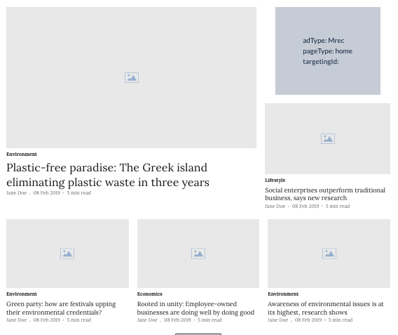
6. Arrow: Three Col Six Stories
The layout features a collection of 6 stories presented in 3 rows, with one story prominently occupying the most space. Additionally, there is an Ad/Widget slot integrated into the design. This layout is specifically designed to support the collection of stories page type. Notably, the 'read more' button does not trigger any subsequent load.
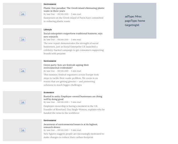
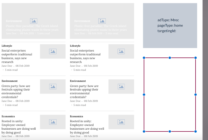
7. Arrow: One-Col StoryList
It displays stories in a single column as a list. This layout supports the collection of stories page type. There is an Ad/Widget slot on the right-hand side. The ‘read more’ button has a subsequent load count.
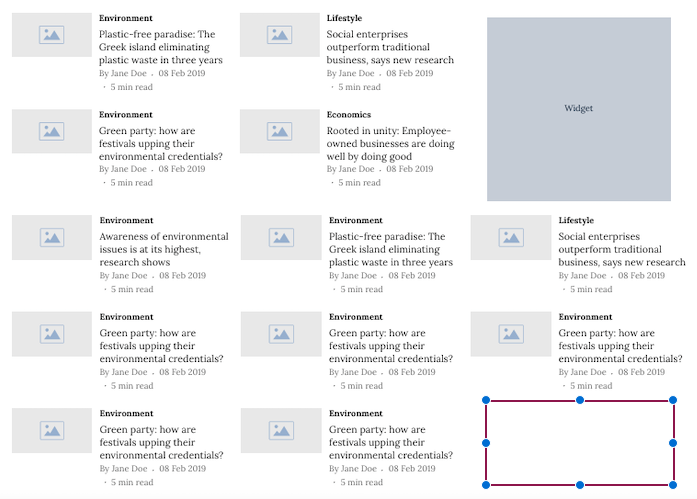
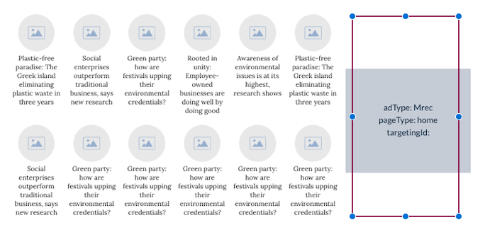
8. Arrow: Three Col Flex Stories
The layout features a grid format with 12 stories presented at once, organized into 3 columns and 4 rows. It is specifically designed to support the collection of stories page type. Within this layout, there is an Ad/Widget slot available. However, a potential issue arises when a widget or Ad is added to the layout, resulting in an empty space in the 3rd row.
To address this wide space issue, a simple solution is to increase the subsequent load count. By doing so, the system will load more stories as users interact with the 'read more' button, filling in the empty space with additional content. This implementation not only resolves the space problem but also ensures a seamless and immersive reading experience for users, as they can easily access more content without leaving the current page.
9. Arrow: Two Col Ten Stories Sidebar
The layout of this display consists of multiple columns and two rows, where one story takes up the most space, and other stories are presented in a list format. Additionally, there is an Ad/Widget slot included. This layout is specifically designed to support the collection of collection page types. Notably, the 'read more' button does not trigger a subsequent load count for additional content.
However, it's important to be aware of a known behavior in this layout. When a widget or Ad is added to the display, there may be an occurrence of empty space or widget space in the third row. Unfortunately, this issue cannot be resolved due to the layout's lack of support for subsequent load count functionality, which would otherwise manage the space more effectively.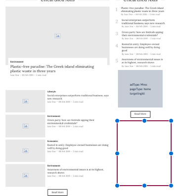
10. Arrow: Collection Filter
This layout is designed to accommodate the "collection page" type. It allows for the collection of collections, with a maximum limit of 11 sub-collections that can be mapped to the main collection. Additionally, the layout includes an Ad/Widget slot for advertising or other content. Notably, the "read more" button does not implement a subsequent load count, meaning that all content is displayed directly without the need for additional loading actions.
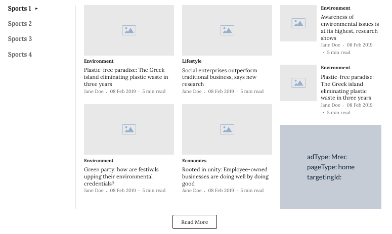
11. Arrow: Twelve Stories Tabs
This layout offers the flexibility to display multiple collections within a main collection, supporting the collection of collection page type. A maximum of six collections can be mapped to the main collection, and it includes an Ad/Widget slot for additional content. The 'read more' button doesn't implement a subsequent load count.
It's important to be aware of a known behavior in this layout. When a widget or Ad is added, there might be an empty space or widget space appearing in the third row at the top or bottom. Unfortunately, this issue cannot be resolved due to the layout's lack of support for subsequent load count functionality, which would have managed the space more effectively.
12. Arrow: Three Col Twelve Stories
This layout features the display of stories from three collections within a main collection, presented in three distinct columns. Each column includes a convenient 'read more' button that directs users to the relevant section displayed in that column. This layout is specifically designed to support the collection of collection page type and includes an Ad/Widget slot.
However, it's important to note that there is a known behavior in this layout. When a widget or Ad is added to the layout, an empty space or widget space may appear in the third row. Unfortunately, this issue cannot be resolved as the layout does not support subsequent load count functionality, which would otherwise manage the space more effectively.
You may be also interested in Page builder layouts