Story Demarcation
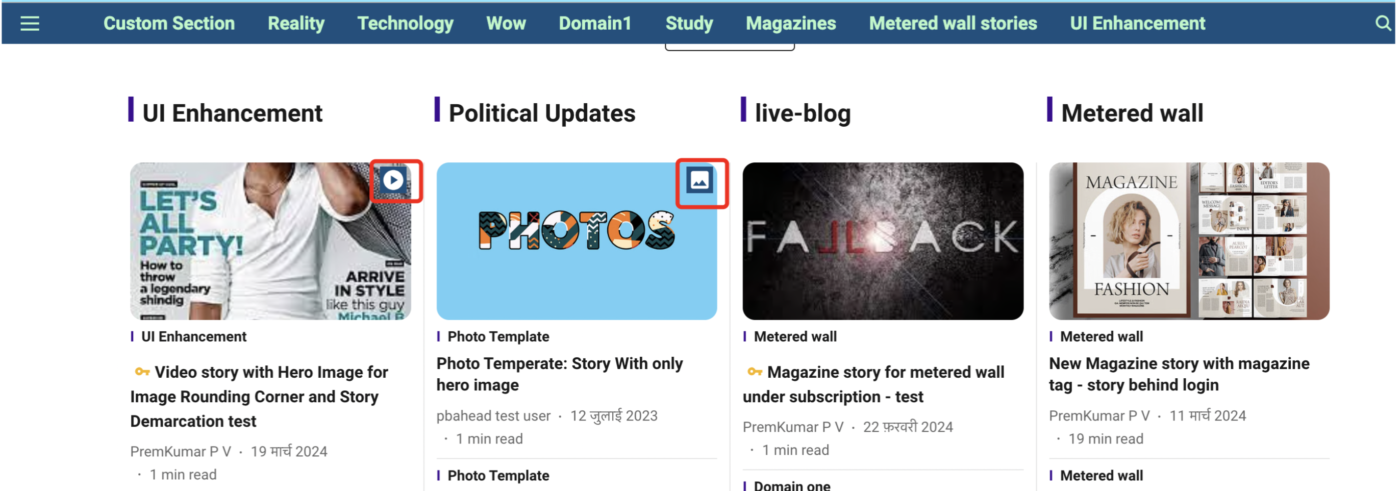
The story demarcation feature is designed to indicate or provide a hint about the type of story being displayed. For example, if a story is a video story, the publisher can indicate it using a 'video' icon. This feature aims to improve the user experience and drive organic views.
To access the story demarcation settings, please follow below steps:
- Login to Pagebuilder
- Navigate to General Settings > Styling > Story Demarcation
- New demarcation settings for Photo, Video, and Visual Story
- Default settings are disabled for publishers
- Default icons provided for each demarcation type
- First icon selected if no style chosen but demarcation enabled
- Color palette available for each setting in Light and Dark mode
- Default black and white color combination if no color chosen
- Refresh icon in color palette sets default black and white icon color combination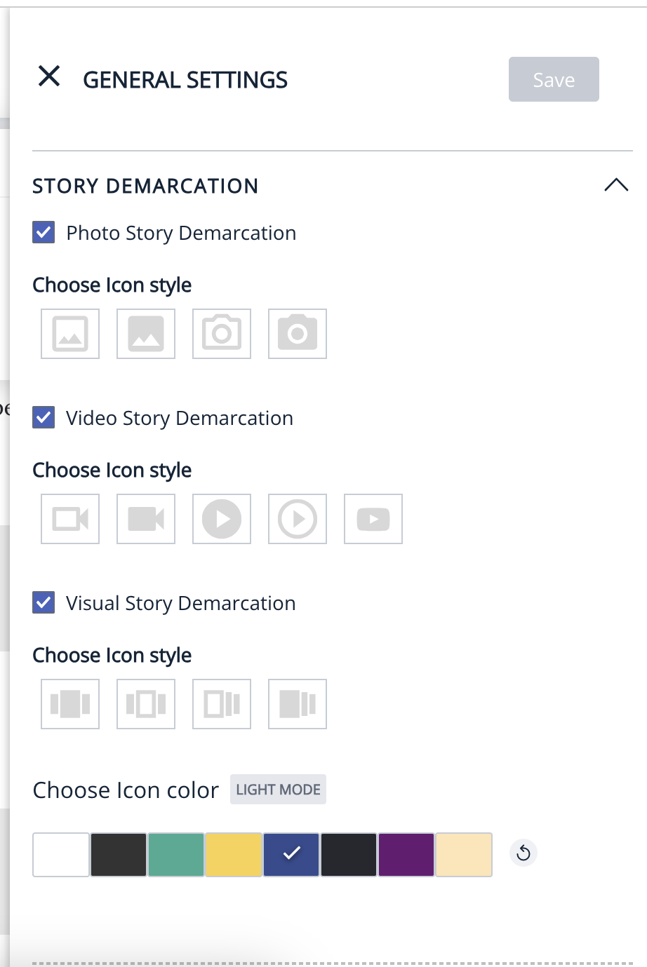
How front end looks/works with the story demarcation?
1. For LTR (Left-to-Right) languages:
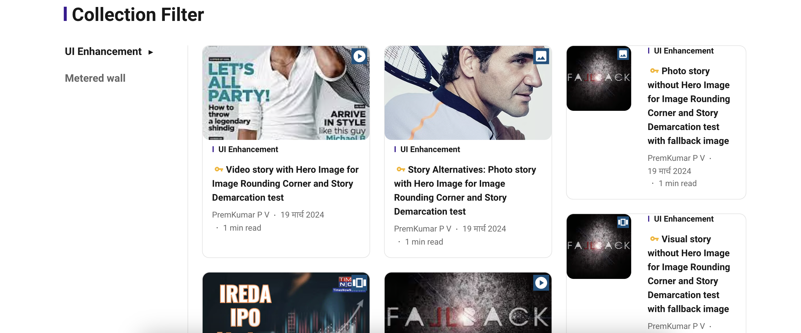
- The story hero image thumbnail will have the selected demarcation icon style with the respective color chosen in the top right corner of the story hero image thumbnail.
2. For RTL (Right-to-Left) languages:
- In the case of RTL, the demarcation icon will be displayed in the top left corner of the story hero image thumbnail.
3. Story demarcation will be displayed on the Home page, Section page, Collection page, Tag page, Author page, and Search page.
- Story demarcation will not be displayed on the Story page.
- Story demarcation will not be applicable or displayed for rounded story thumbnail images.
Rounded Corners
The rounded corners feature is introduced to enhance the UI of the website.
To enable rounded image corners in Page Builder, follow the below steps:
1. Login to Page Builder.
2. Navigate to General Settings.
3. Go to Visual > Settings.
4. By default, the rounded image corners setting is disabled for publishers.
5. Publishers who are interested in this UI enhancement can enable it in Page Builder.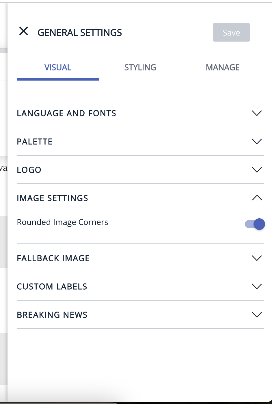
How front end looks/works with rounded corner image setting?
- Story hero images will have rounded corners once the publisher enables the setting in PB.
- This feature not only rounds the images but also the borders of the images if the border is enabled for the layout.
- Rounded corner feature is applicable and visible on the images in the Home page, Section page, Collection page, Tag page, Author page, Search page, and Story page.
- Rounded corner is applicable for all layouts except the layouts (Arrow: Opinion collection and Arrow: Twelve Stories tab) which have a rounded image template.
- Rounded corner will be applicable for hero images or videos on the story page if the Story templates image type setting was selected as "within container" in PB.
- Rounded corner will not be applicable for hero images on the story page if the Story templates image type setting was selected as "Full Bleed" in PB.
Here are some important points to note:
1. In the story page, rounded corners will only apply to Images and video story elements. It may not work for jsembed videos/images and other story elements like Image Gallery, Slideshow.
2. On the Full Screen slider layout, during the transition of images in auto slide, it's visible that the rounded corner goes off and comes back once the image settles down.
3. On mobile devices, the Full Screen Slider layout may have the arrow placed in the center, hiding the rounded corner. We acknowledge this issue in the production environment.
4. In the Four Story Slider layout, the rounded border and demarcation on the fourth story card may not be displayed properly. We acknowledge this issue with the layout.
5. On mobile devices, the2 column 4 stories Highlight Layout should not have rounded corners for the primary story image, as the image is full bleed for this layout on mobile.
6. Story Demarcation icon positioning for LTR and RTL cannot be customized based on publisher requirements.
7. Publishers cannot add any new icon styles for Story Demarcation.
Page-Builder Release Note - 8th Apr 2024
UI/UX Improvement - Minor enhancement on Story Demarcation icon colour
Prior to the update: Previously, the icon colour didn't change dynamically in Light and Dark Mode.
Following the update: Story Demarcation Icon colour will change dynamically based on the user selected colour (i.e. If user selected colour is dark then icon colour will be white and vise versa in Light and Dark Mode).
Light Mode

Dark Mode
Page-Builder Release Note - 29th Mar 2024
UI/UX Improvement - Rounded Corner Images
Prior to the update: Previously, images on the front end displayed sharp edge corners in the hero image of the story, lacking rounded corners.
Following the update: The Page Builder now supports rounded corners on images. This enhancement applies only to images and video story elements. Please note that it may not apply to embedded JavaScript videos/images or other story elements like Image Galleries or Slideshows.
UI/UX Improvement - Story Demarcation
Prior to the update: Previously, there was no image or video demarcation for easy identification of different types of stories.
Following the update: The Page Builder now supports demarcation to visually differentiate between different types of stories, such as articles, videos, or photo galleries. This enhancement provides users with a visual cue to quickly identify the format of the content they're about to engage with. Say, if a story is a video story, publisher can indicate it using the ‘video’ icon provided. This is aimed at providing a better UX to the end user and there by drive organic views.